Skip to content
HOME
ABOUT US
HISTORY TIMELINE
VISION & MISSION
MEET OUR TEAM
EMBLEM
ANIMAL FEEDS
Shrimp Feed Products
Fish Feed Products
OEM Service
INVESTOR RELATIONS
NEWS & ACTIVITIES
NEWS
ACTIVITiES
SUSTAINABLE DEVELOPMENT
CORPORATE SOCIAL RESPONSIBILITY (CSR)
POLICY
Contact Us
SALEMAN
JOIN US
DOWNLOAD
Menu
HOME
ABOUT US
HISTORY TIMELINE
VISION & MISSION
MEET OUR TEAM
EMBLEM
ANIMAL FEEDS
Shrimp Feed Products
Fish Feed Products
OEM Service
INVESTOR RELATIONS
NEWS & ACTIVITIES
NEWS
ACTIVITiES
SUSTAINABLE DEVELOPMENT
CORPORATE SOCIAL RESPONSIBILITY (CSR)
POLICY
Contact Us
SALEMAN
JOIN US
DOWNLOAD
EN | TH
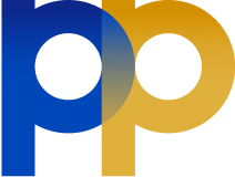
EMBLEM
PP
is People
Prime
is The Best Thing
Logo identity that reflects the identity of PP PRIME Public Company
We conducting business under the concept of sustainability innovation development and
responsibility is the most important, we response in society, environment and economy.
Design
Emblem (LOGO) Designed using the Golden Ratio to create the letter P to create stability, balance, and strength.
The letters are connected by an overlap, representing the organization's working together towards the ultimate goal,
in a systematic, orderly and unified manner
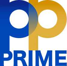
The use of the PP PRIME logo
on a light-colored background includes
1. Corporate Logo Vertical
2. Corporate Logo Horizontal
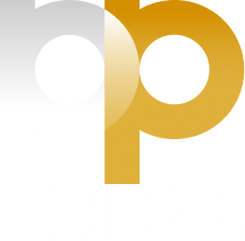
The use of the PP PRIME logo
on dark backgrounds includes
1. Corporate Logo Vertical
2. Corporate Logo Horizontal
Primary Colors
used within the organization consist of the following main shades
1. Blue
Pantone
2728 C
2. Gold
Pantone
P 10-15 C
Secondary Colors
are color values that are darker and more vivid from the primary shade. Used for gradation only.
HEX/HTML
#0047BA
HEX/HTML
#D39000
HEX/HTML
#0D278B
HOME
ABOUT US
HISTORY TIMELINE
VISION & MISSION
MEET OUR TEAM
EMBLEM
ANIMAL FEEDS
Shrimp Feed Products
Fish Feed Products
OEM Service
INVESTOR RELATIONS
NEWS & ACTIVITIES
NEWS
ACTIVITiES
SUSTAINABLE DEVELOPMENT
CORPORATE SOCIAL RESPONSIBILITY (CSR)
POLICY
Contact Us
SALEMAN
JOIN US
DOWNLOAD
Home
Investor Relations
News
Contact Us
About us
Vision & Mission
Our team
History Timeline
Emblem
Animal Feeds
Shrimp Feed Products
Fish Feed Products
Pet Food Products
Sustainable Development
Corporate Social Responsibility
Policy