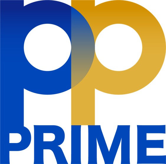
Logo identity that reflects the identity of PP PRIME Public Company
We conducting business under the concept of sustainability innovation development and responsibility is the most important, we response in society, environment and economy.

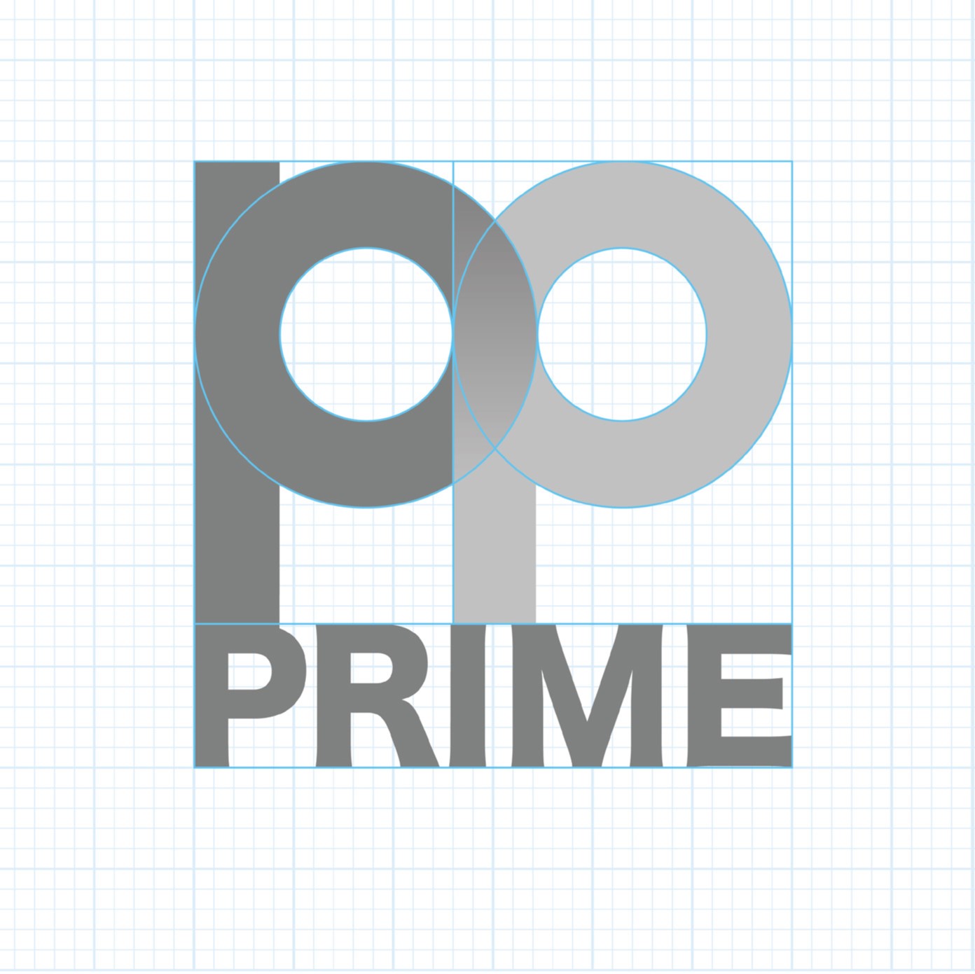

1. Corporate Logo Vertical
![]() 2. Corporate Logo Horizontal
2. Corporate Logo Horizontal
1. Corporate Logo Vertical
![]() 2. Corporate Logo Horizontal
2. Corporate Logo Horizontal
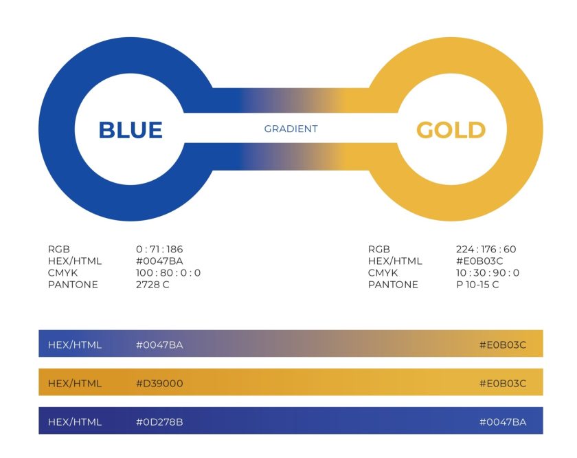
1.Blue (Pantone 2728 C)
2.Gold (Pantone 2728 C)
Secondary Colours It is a color value that is darker and more vivid from the main shade. Used for gradation only.